
PROGRAMMING UPDATE: That TV show called “The Great Create” where I compete against another photographer, is now live. You can catch it right here.
I’m going to simplify what causes the problem, (so no nerding or geeking out over this), but essentially it’s this:
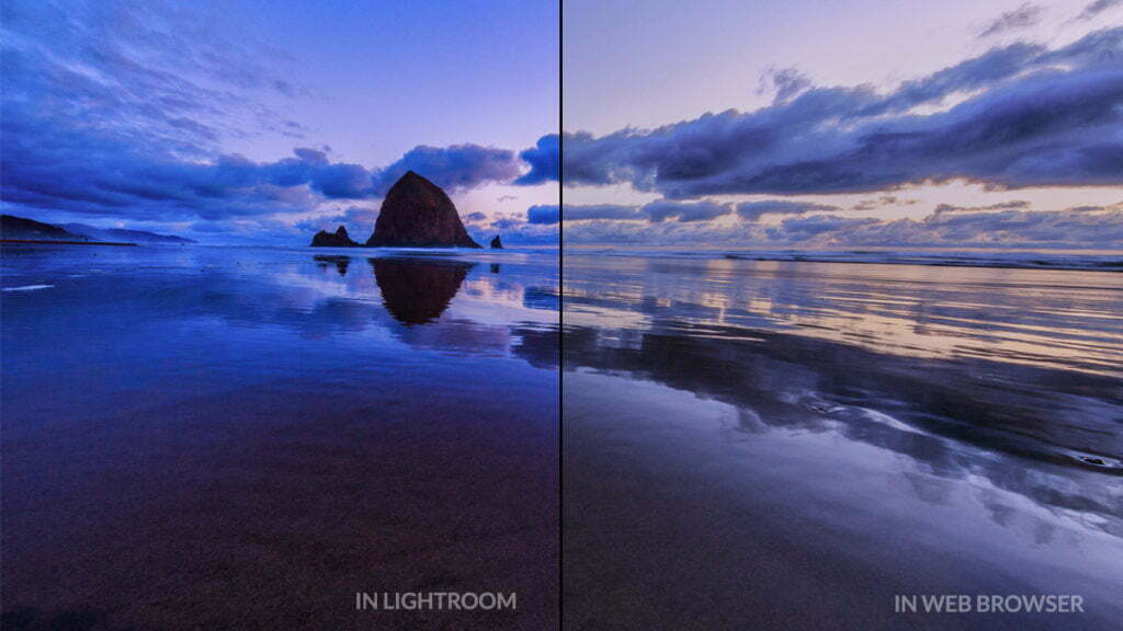
a) Lightroom uses the ProPhoto RGB color space, which is awesome for editing images and making photographic prints, but it can be pretty horrible for viewing images on the Web.
b) Many Web browsers out there use the more limited (color wise) sRGB as their default color space. So, when you upload an image saved with Lightroom’s default ProPhoto RGB space, those browsers can’t display that wide ProPhoto RGB range of rich colors, so to people using those browsers, your images’s color will look washed out and flat. It’s frustrating and heartbreaking, but it’s easy to fix.
You adjust for this problem when you’re saving the file you’re going to share online, so this happens in the Export window.
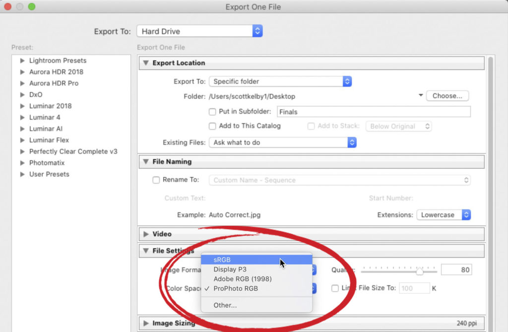
In that window, down in the File Settings section, all you have to do is to go to the Image Format pop-up menu and choose sRGB (as shown here). That’s it. Now, when you export your photo and share it on Instagram, or Twitter, etc.,, its color will look nearly identical to how the image looked when it was in Lightroom.
Hope you found that helpful. 
My Field Report on the Canon EOS R6 Mirrorless is here
I just posted it over on my blog today about using it a few days in the field. I shared my focus settings for shooting aviation (or wildlife), and while there is lots to like about the camera, there is a really bad thing, too. Here’s the link if you’ve got a sec.
Here’s wishing you a totally kick-butt week!
-Scott
The post If You Share Your Lightroom Images on Instagram, And the Color Looks Off, Do This… appeared first on Lightroom Killer Tips.