How to keep consistent colors in Photoshop
Sometime, you go to output an image and suddenly, the color changes. Or you are trying to combine 2 images and the colors change. What gives?
This tutorial shows you how to keep your colors matching perfectly and explain why they change, as well as how to prevent color shifts. The first part of this Photoshop tutorial, show you how to prevent color shift.
The 2nd part of this tutorial explains basic color management in Photoshop. Even if you are a beginner, these essential steps will help you work with consistent color throughout your workflow. This is not a tutorial on monitor calibration, It’s a tutorial on setting up Photoshop. This applies to any version of Photoshop.
Stop Photoshop changing colors on export
Start with a photo and you want to export a jpg. (This is a photo, I made of talented musician, Taylor Davis.)

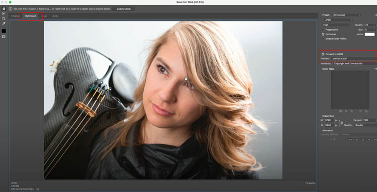
Choose File>Export>Save for web.
Usually it starts in the Optimized tab, showing a preview that may or may not match the original.
In this case, it’s close, but more saturated color than the original.
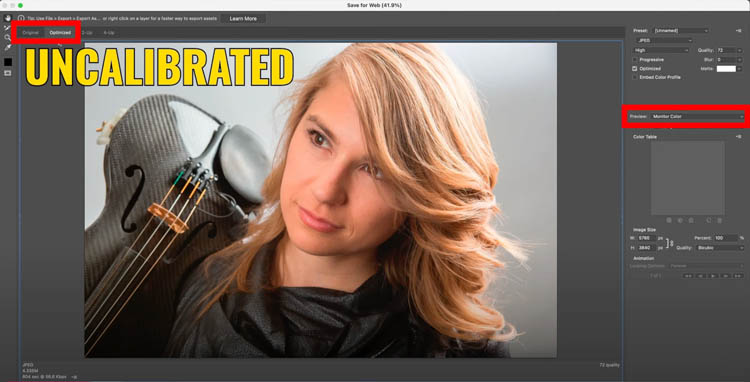
Here is the same image before I calibrated my monitor. The color is different but by more.
The more different this looks, the more you need to calibrate your monitor. Even a calibrated monitor, will be slightly different (with these settings) as you see in the first image.
 ‘
‘
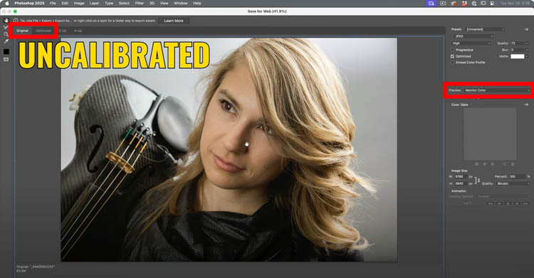
Here is another example of uncalibrated. When I change to the Original tab, it’s different again. You might be seeing these types of shifts. Which is the real color? (Tip: what you saw in Photoshop).
‘
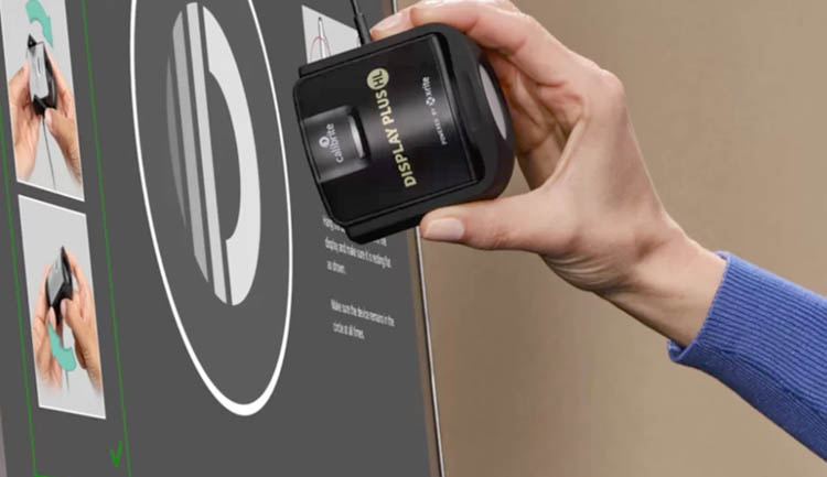
If your colors are wildly off, or you have never calibrated your system, it will make a difference. This is not a tut on Calibration (I can do one, if I get requests). To calibrate, you will need a monitor that supports calibration. I use BenQ monitors. Disclosure, I am a BenQ ambassador, but the isn’t a sponsored tutorial and not a tutorial about monitor calibration. If about Photoshop color settings.

You will also need a device like the Calibrate Display Pro HL, If these is demand, I’ll do a tutorial on Monitor calibration.
How to view Accurate Color in Save from Web in Photoshop
Here is the first tip: Where it says preview in save for web, see if it says Monitor color
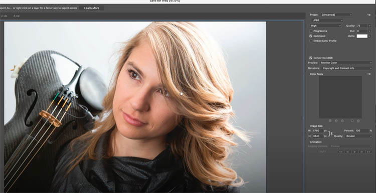
Change to Use Document profile. You should see a big difference. For many users, this alone will solve or greatly reduce the problem.
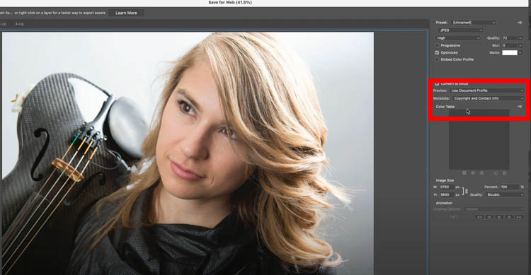
Notice how the colors now perfectly match (on a calibrated display).
The good news, even if the colors don’t match perfectly in Save for web, the output jpg or png image should still match the original.

Export as, an alternative way to export
Adobe wants us to use the newer Image>Export>Export as
You should notice the preview colors are closer to the original. The downside to Export as, is that lack of metadata and some other options, which leaves me still using the Save for web.

Hopefully, this helps you get better previews in save for web. Ok, now, lets set up Photoshop to give us perfect colors every time.
Basic Photoshop Color Management (Please read).
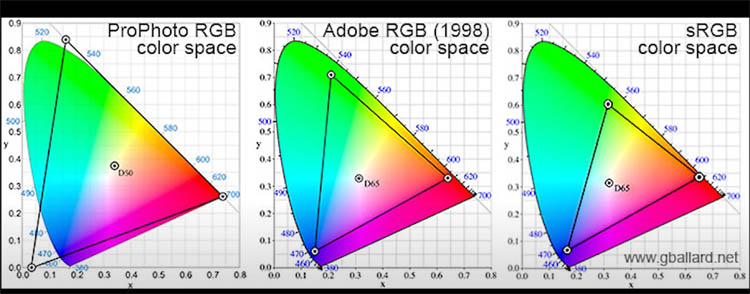
Within the RGB (Red, Green +Blue) world, there are different profiles (AKA color spaces).
- ProPhoto RGB supports the most colors (aka Largest Color Gamut), but not all colors can be displayed on your monitor.
- Adobe RGB is a reasonably large color space that can be displayed on monitors that boast 98%-100% Adobe RGB colors, this is common for printing to a desktop printer.
- sRGB is a smaller colorspace, but all the colors can be viewed on almost any monitor. Because of this, it’s the most common color space for sharing images online. Going to sRGB will cause you to lose some colors, so it’s best as an output file, not your working color.
There are other color spaces , such as P3 which is used by Apply on their devices and is also a good working color space for certain things. It’s a good idea to keep the original file in the largest color gamut possible, to preserve colors (in RAW, this doesn’t matter). Then work on your preferred profile for the image that you are going to output.
To view the color space in your image, choose Document profile from the bottom menu in Photoshop

Here this image is Adobe RGB. (16bpc means its a 16 bit file).
For my workflows, I use Adobe RGB and output to sRGB for sharing online and social media. (Some people use ProPhoto and their reasoning is it supports more colors and has a wider color gamut. For my needs right now, I prefer to be able to view all my colors on my monitor and use Adobe RGB and have a 99% Adobe RGB display on my Benq SW321C.
Please note, I shoot in RAW and store my images in Lightroom, so I don’t lose any color info on my originals. RAW files transcend any color space, because the RAW sensor data is preserved. If you don’t understand that statement, don’t worry, read on.
I set my settings to Adobe RGB in Lightroom and Photoshop, as well as on my camera.

Setting the Default Color Profile
Choose Edit>Color Settings
This is where you choose the default colors Photoshop will use.
Working spaces>RGB this is where you choose the profile that you want to use. Whenever you create a new document, it will now be created into this space.
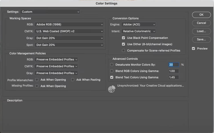
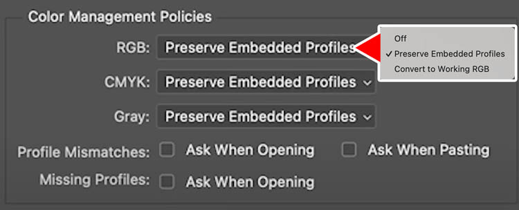
You can choose how Photoshop handles images that have a different profile, under Color Management Policies.
If the color profile is different than your working space (Adobe RGB in this case) :
Off: The color profile is removed from the image and it becomes untagged.
Preserve Embedded Profile: (my preferred choice) The image opens and the color space is unchanged. (You can manually change it with Image>Convert to Profile).
Convert To working RGB: Every image you open is automatically converted and tagged with the working space. For some people with a closed workflow, this might be a good choice. In my case, I working with different clients and across many different types of mediums, so I prefer to only change what I want to change and do that manually.
Converting Color Profiles
If you image profile is different, or to shows untagged (no color profile attached) then you need to convert it.
There is a wrong and right way to do this, If you choose Image>Assign Profile

You will notice Photoshop shifts the color as you change profiles.

Choose Image>Convert to Profile
Now you can change the profile without changing colors in your image.

If you follow the proceeding streps, you should have less issues with color mismatches.
Hopefully you found this helpful
Great to see you here at the CAFE
Colin
PS Don’t forget to follow us on Social Media for more tips..
(I’ve been posting some fun Instagram and Facebook Stories lately)
You can get my free Layer Blending modes ebook along with dozens of exclusive Photoshop Goodies here 
The post Basic Color Management in Photoshop for beginners appeared first on PhotoshopCAFE.
