
Last week I wrote an introduction to the new Color Grading panel, and this week I wanted to follow up with a deeper look.
Applying Your Own Color Grade
For the most control over all aspects of the tint you want to apply I recommend zooming into viewing just the one color wheel you want to adjust (you can only see one color wheel at a time on mobile). I’ve reset the settings on the photo of my sweet dog, and applied the Adobe Neutral profile to make it as flat as possible. I’ve also tried to neutralize the white balance too. Starting from this flat and neutral place, let’s go through the process of color grading the image to along with the fall colors in the photo itself, and give it more life. Color grading is much more about creative looks and styles, and as such, it can be very subjective. I’ll use settings that are stronger than what I might normally choose to make it easier to see, but just keep in mind that you can turn down the visibility of a tint by reducing its saturation.
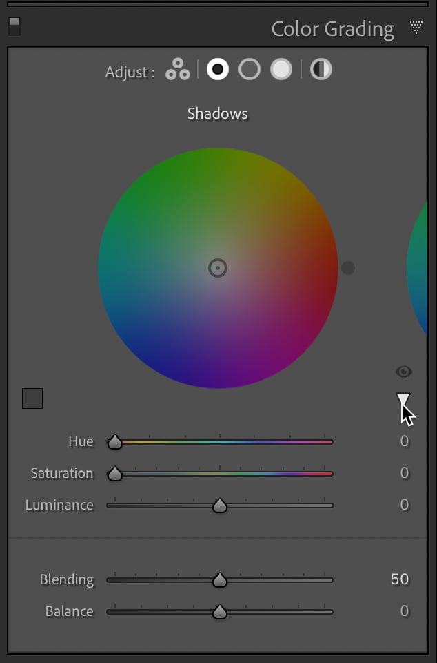
After clicking the button for Shadows to enlarge its color wheel, I can also more easily see the Hue and Saturation values when they are applied. If you click the associated disclosure triangle, those fields expand into sliders. On the left side of the panel you’ll see a Color Swatch, which we’ll put to use shortly (note, only Lightroom Classic has this cool feature).
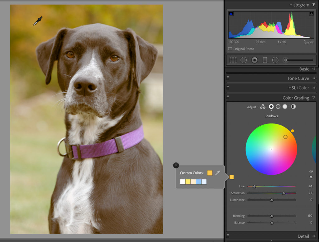
What I’d like to do is use the warm golden color from the leaves in the background as the tint I want to add into the Shadows. Clicking the Color Swatch opens the Color Picker, which contains an eye dropper for sampling color from the photo as well as some saved swatches. To sample a color from the photo, click on the Eye Dropper and hold down the mouse as you drag out onto the photo. As you move the cursor over the photo you’ll see the color wheel change to reflect the hue and saturation of the pixels under the cursor. Release the mouse button when you find a tint that you like.
You can then fine tune the hue and saturation with the sliders to dial in just the right amount for your vision. I like to save adjusting the Luminance sliders after I’ve added a tint to each range I want to affect. Notice that when zoomed into one color wheel you’ll see the edge of the next color wheel on either the left or right (or both) sides depending on which color wheel is active. You can click the edge of the other color wheel to switch to the neighboring wheel. The circles at the top of the panel will show a darker center for whichever color wheel is active.
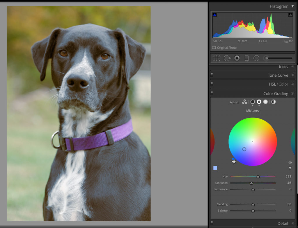
Moving on to the Midtones, I decided to pick a complimentary color to the hue I added to the shadows. With these color wheels, the complimentary color is just 180 degrees around the wheel from the selected color. So, if I applied an orange-yellow to the Shadows, then opposite that on the color wheel would be a nice blue. A visual way to achieve this is to right-click the first color wheel with the tint applied (the Shadows in this case) and choose Copy Settings from the contextual menu. Then right-click on the color wheel you want to change (Midtones in this case) and choose Paste Settings from the contextual menu. Now you have the same settings on both, but to choose the complementary color, just move your cursor to the opposite side of the color wheel and click. The Saturation value will remain the same, but the Hue will change to the color where you clicked.
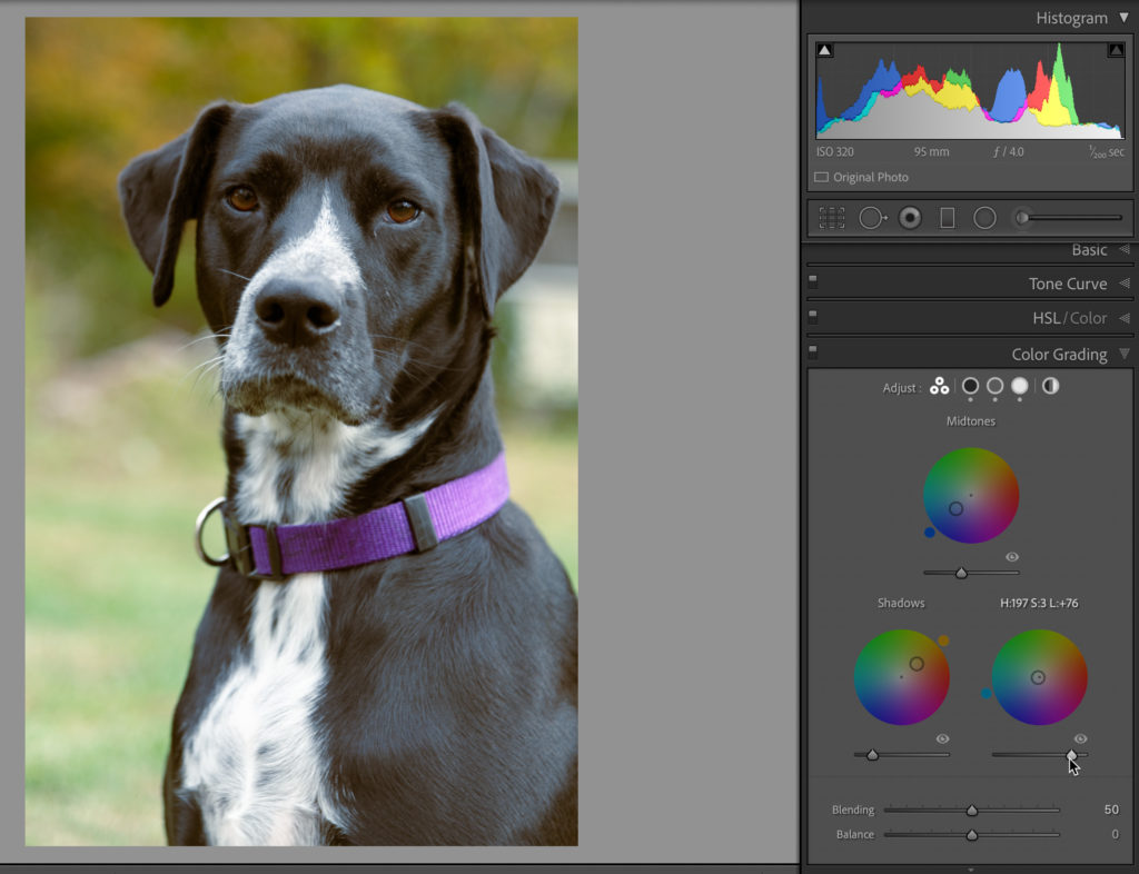
For the Highlights, I used the Color Picker to select a hue from the white fur on her chest, with a really low Saturation value. With a tint for all three tonal ranges selected, I clicked the button with three circles to see all color wheels at once. Now, I can use the eye icon to briefly disable the tint on each color wheel to see how it looks, and fine tune saturation as needed. Clicking the dot that represents the Saturation level within the color wheel locks in the Hue, and allows you to tweak Saturation easily. To lock in Saturation and adjust Hue, hold the CMD key (PC: CTRL), and click and drag to tweak Hue. Once I’m happy with those values I’ll move on to adjusting the Luminance slider for each tonal range to dial in the desired look. In this case, I reduced the Luminance of Shadows and Midtones, and brightened up the Highlights.
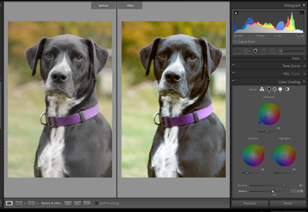
As a final tweak, explore how the Blending and Balance sliders provide fine tuning control over the blending of tint between tonal ranges and how much influence you want to give to one tonal range over the others. Here’s a Before and After view showing the results of the adjustments I made to Blending and Balance.
You can take it even further by adding a global tint on top of what you’ve already added to each tonal range, but I did not elect to do that to this photo. The Global color wheel works in the same way as the others, but the effect is, well, global.
I’m very excited by how much you can do with just this one panel, and the possibilities are almost endless. Just thinking about ways you can combine the effects produced by this Color Grading panel with Profiles, HSL, and the Tone Curve gets me thrilled to explore and experiment further! Be sure to save settings combinations you discover in your own custom presets as you go.
The post Color Grading Continued appeared first on Lightroom Killer Tips.