
The UK’s “Digital Camera World” site is one of my favorite photography sites, and this past week I ran across this post from a Lightroom user who had switched from Classic to LR ‘cloud’ and came running back to Classic.
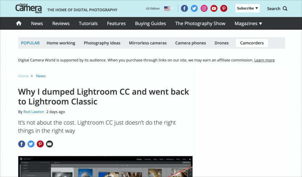
He does a point-by-point list of what Lightroom ‘cloud’ still doesn’t do, with missing features like not having Smart Collections to Virtual Copies (though he left a bunch off his list). Here’s the link if you want to give it a read.
I agree with his reasoning in the post (and I have even more reasons than he listed), but one thing emphasized in the post really struck a chord with me, when he wrote:
“Well, I’m torn. I LOVE the Lightroom CC [cloud] interface compared to the creaky relic that is Lightroom Classic. If only I could have both! But the fact is, Lightroom CC just doesn’t work for me.”
—ROD LAWTON, Digital camera world
Man, he’s got a real point on that interface. Why can’t we have both? The look (interface) of Classic is very much the same as it was when it launched almost 14 years ago. The ‘cloud’ version of Lightroom has a much more modern and streamlined interface, which Adobe could easily apply to Classic.
Now, don’t rush to the comments and post “It’s because Adobe doesn’t care about Classic” because you’ve been saying that since 2017, yet Adobe keeps adding lots of new features and improving Lightroom Classic year after year, yet this one low-hanging fruit still hasn’t been updated, and by seriously Adobe, it’s time! In fact, it’s LONG overdue! (NOTE: of course, bug fixes and problems with releases are expected to be fixed by Adobe — I’m not talking about that stuff — this is when it’s time for NEW features to be added).
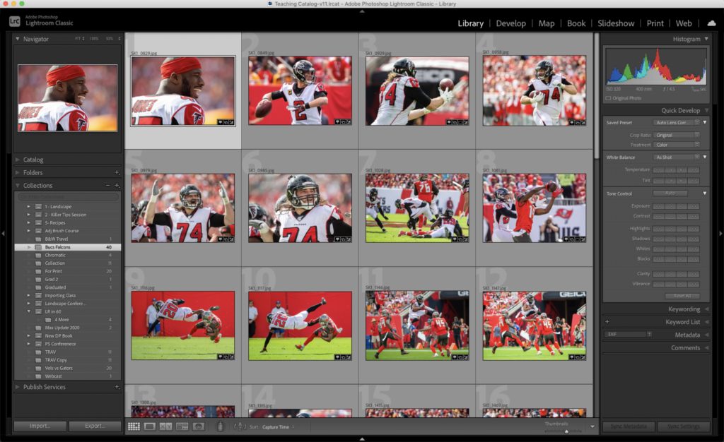
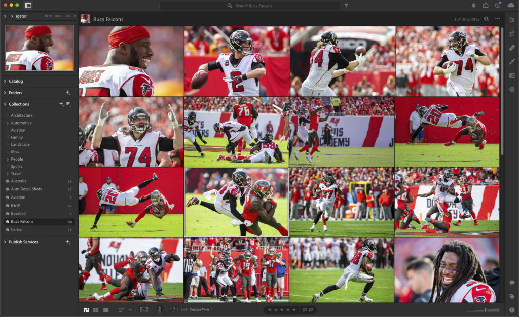
What might Classic look like if they did update its look?
I show in the first capture (below) how Classic looks today, and then below it I applied the cosmetic changes from LR ‘cloud’ to Classic just to see what it might look like, and I have to say — it does look much more modern and fresh.
Now let’s do the same thing to Lightroom Develop module — with its two-sided panels and filmstrip along the bottom and update it with the Edit space look from LR ‘cloud’
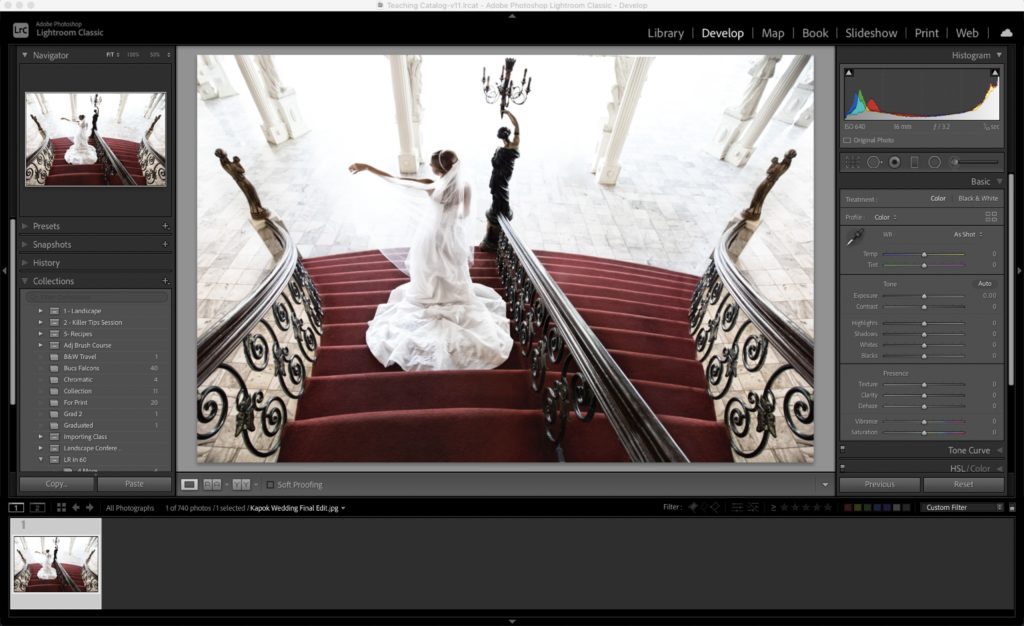
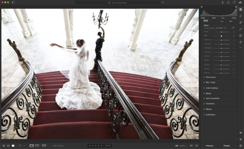
Again, it’s a cleaner, more modern look, and a lot of it is simply changing the fonts, the arrow before the panel’s name, and the shades of gray. Doesn’t seem like that’s too much to ask, and like he says, “Why can’t we have both?” (the features of Classic with the updated look of LR ‘cloud’)?
Let me know what you think in the comments below, both on his comments, and on this interface tweaking I’ve done above.
Hope you all have a rockin’ week, a safe and happy one, too!
-Scott
P.S. Today over on my daily scottkelby.com blog we officially announced the Wildlife Photography Conference coming March 16-17, 2021 that I’ve already sneeked to you guys here in LRkillertips. Here’s the link if you’ve got a sec.
The post He Dumped ‘Cloud’ And Went Back To Classic. Here’s Why (and one thing that could help) appeared first on Lightroom Killer Tips.