
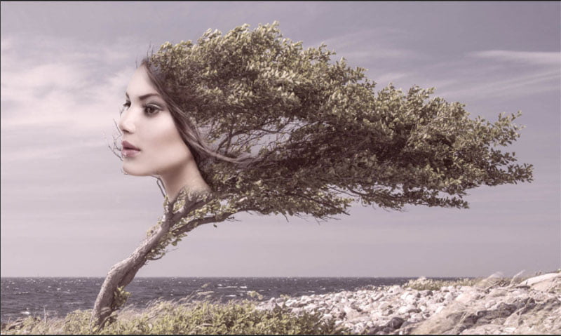
Making Duotone images in Photoshop and using the tools in a new way for color grading.
In this Photoshop tutorial, you will learn how to make a duotone color in Photoshop.
You will learn both the traditional duotone process for printing, as well as a way to use these tools to color grade regular RGB images in a new and powerful way. In this Photoshop tutorial, I’m pulling from my real-world experience as a working Graphic Designer and mixing it with my Photography experience to produce something that I think is quite unique in the Photographer’s world, and the road a little less travelled for younger designers.
What is a Duotone?
Traditionally a duotone is a way to increase the dynamic range in a grayscale image. (But it’s much more, read on). When printing a grayscale image (on a printing press, not a desktop printer), there is very limited dynamic range in a single plate of black. You can add additional color plates and add gray ink, to create a very nice print with more printable gray tones and lots of dynamic range. Alternatively, you could use different colored inks for each of these plates and produce some very nice looking prints. You have probably seen these in high end black and white prints or coffee table books. This process is also used to produce colored images. Not that long ago, it was less expensive to print 2 or 3 colored inks, rather than the 4 color process (CMYK which produces full color). I remember producing duotone images (also spot color jobs, which is another discussion for anything time) to save money on print job or 2. These days 4 color process printing is so inexpensive that you wouldn’t do this to save money anymore. Please understand that I’m oversimplifying the definition as uses of duotones here and could write many more paragraphs about this and get much deeper, but since this is a Photoshop tutorial and not a printing tutorial, this simple explanation should be enough for the average person (I know, most of you don’t want to read paragraphs about this).
When you make a duotone, you are crating a 2 channel image. The first channel is black, the second channel is a chosen color and then a curve is used to distribute the color. A tritone uses 3 color and a quadtone uses 4. Adobe lumps all of these under the moniker “duotone”, so shall we. Alright, on with the tutorial…
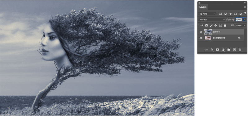
1. Start with the color image (Or Black and white)
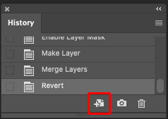
Lets make an exact duplicate of this document and work on the duplicate
2. In the History panel (Window>History), click the duplicate document button
I recommend doing your color conversion in Camera RAW or Channel Mixer before this next step, and this is all walked through on the video at the top, but let’s keep it simple for the written steps, and these steps will work. .
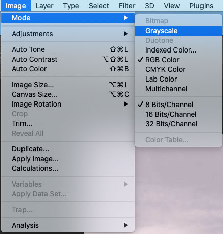
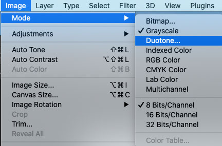
3. Choose Image>Mode>Grayscale
This will convert to a grayscale image
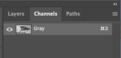
If you look in Channels, we now have a single channel document (RGB has 3)
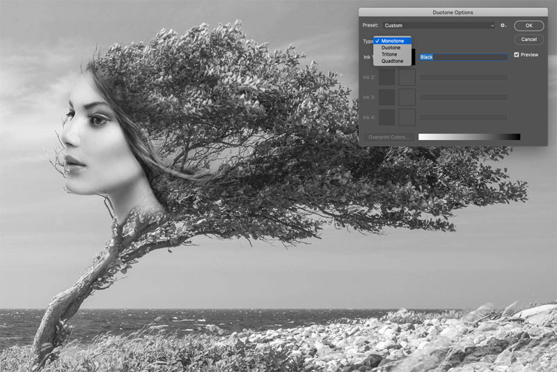
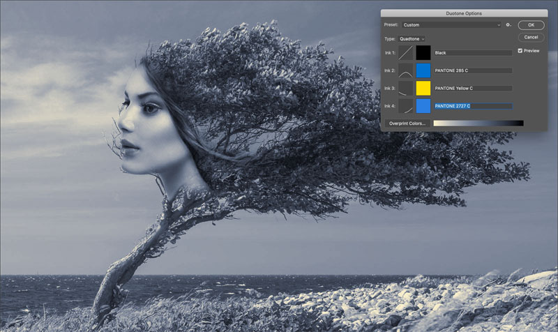
4. Now, choose Image>Mode>Duotone
This is where you have the option to use
- Monotone (single color)
- Duotone (2 color)
- tritone (3 color) or
- Quadtone (4 color)
We will use Quadtone for our example. But choose the amount of inks you will print, if this is going to be a real print job. (For the “duotone effect” in RGB use quad tone).
You will notice by each ink, you have a color swatch and a curve.
The color swatch will be where we choose the color.
The curve will be where that color is applied.
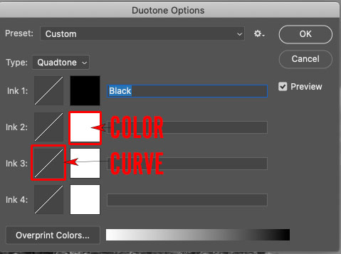
5. Starting with ink 2, click the color swatch.
The color picker will open and you can choose a color like you normally would in Photoshop.
However, if you are going to print and want to use a color library such as PANTONE colors, choose Color Libraries.
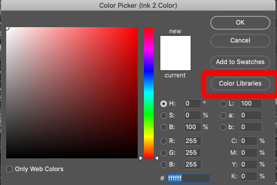
You will notice different color Libraries. In the USA the PANTONE color matching system is the most widely used by graphic designers. Another component is a color chip where you can see the actual printed color and then choose the corresponding numbers from the library. This gives extremely accurate color. The printer (the person who will print the image) will use the actual colored ink, which is specially mixed for an exact match.
6. You can click on Picker to go back to the regular color picker.
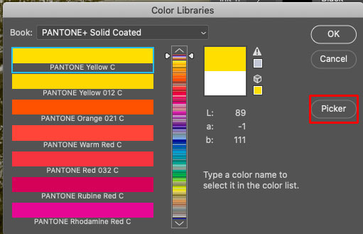
Click ok
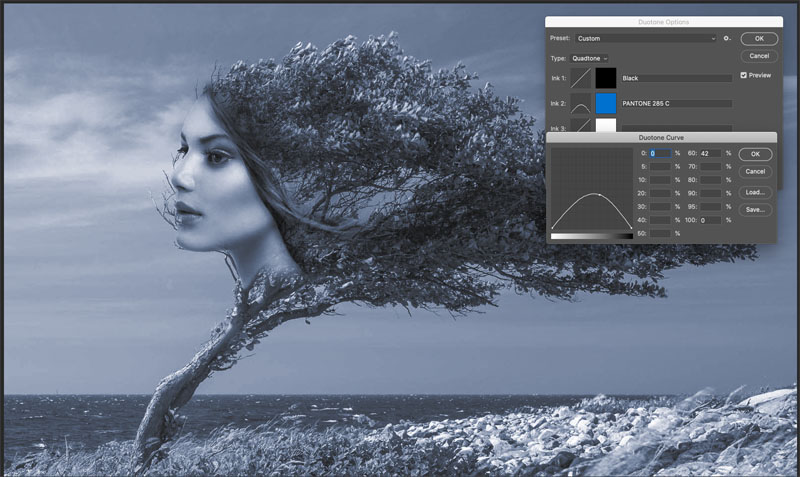
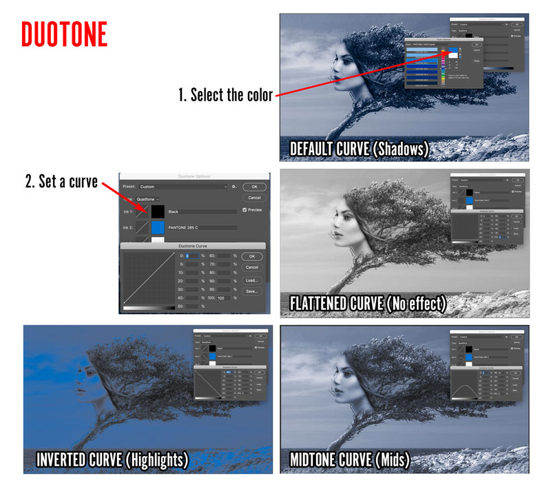
7. Click on the curve to determine where the color will be applied. (How to use curves in Photoshop)
By default the color will be applied to the shadows.
Notice there is a white to black bar at the bottom, these are the tones in the image with Highlights on the Left and Shadows on the right (The opposite of RGB curves because we are working with pigment, rather than light).
In this example, I have set the color to the mid-tones.
These below examples show how the curves affect where the new color will be applied. Color (ink) will be added where the curve is high, where it is low, no color will be applied.
8. Lets add another color. Under Ink 3, apply some yellow to the highlights.
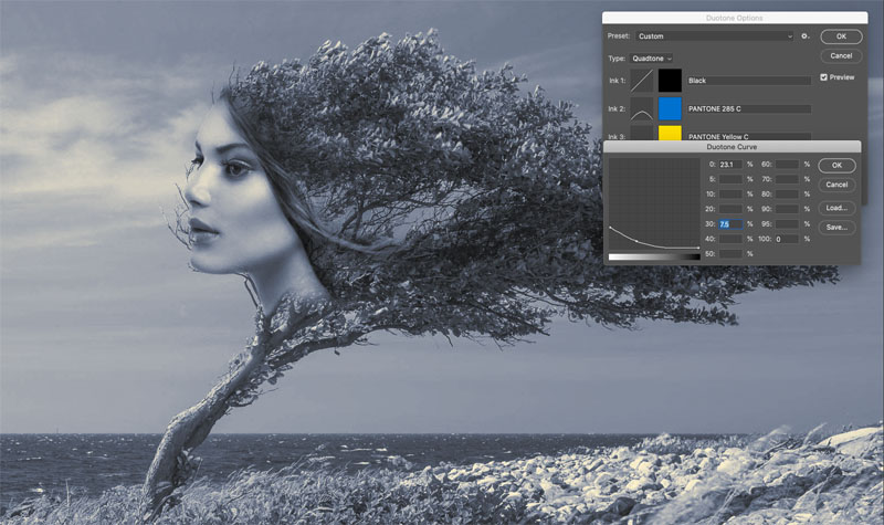
9. And finally we will add a brighter blue to the shadows. See how we get an unmatched control over the color distribution by using this method.
Click ok to apply.
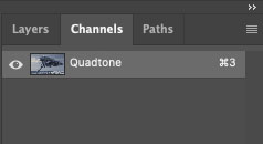
If you look at the channels, there is still only a single channel.
If you are going to use this as an effect on an RGB image, skip the next step.
10. (optional if you are creating color separations) If you are preparing an image for print, choose Image>Mode>Multichannel
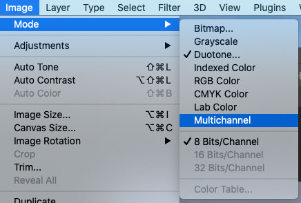
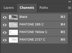
This will create a separation. Each channel shows the color of the ink to be used. These channels will be used to make th printing plates used by the printer. You can save this an a PSD, PDF or EPS and give them to your printer to run the job. I suggest calling your printer and see what format they prefer.
At this point, you are finished if are making a duotone print job. If you are going to print CMYK, or making a regular digital file for sharing on social media etc, or printing on a desktop printer. Don’t convert to multichannel, continue the steps below.
Using Duotone for a color grade effect
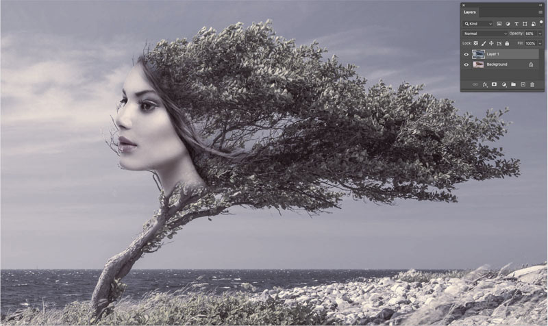
11. Combine the new colored image with the original colored image…
Choose the Move tool.
Click and drag the duotone image into the tab of the original colored image (don’t let go yet).
The image will open in the tab. Hold Down the Shift Key to keep it centered. Release and the dupotone image should now be on top as a new layer.
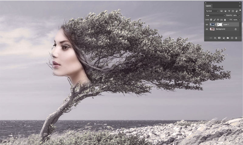
12. Change the opacity of the top layer to blend the new color in with the existing color.
13. If you want to allow some of the original color to shows in certain areas, such as the face, create a layer mask on the layer. (Use the add layer mask button in the layers Panel).
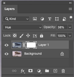
14. Paint on the mask with black, where you want the color to show through.
Also try different blending modes for varying results.
In a way, this technique produces a similar effect to using a gradient map, but this provides a lot more control over the color distribution. Of course, if you are printing with the pantone colors, a gradient map won’t be able to produce the color separations you need.
I hope you enjoyed this weeks tutorial, I know I was pulling a bit more from my Graphic Designer toolbox this week, than my photographer toolbox. If you want to see more designer orientated stuff, let me know.
Great to see you here at the CAFE
Colin
Browse our hundreds of other free tutorials here, or search for what you are looking for in the search at the top of the page.
You can also browse by topics in the free tutorials menu.
If you are ready to get serious about Photoshop, see our full length courses here
PS Don’t forget to join our mailing list and follow me on Social Media>
(Ive been posting some fun Instagram and Facebook Stories lately)
The post How to Make a Duotone in Photoshop, for color grading. appeared first on PhotoshopCAFE.