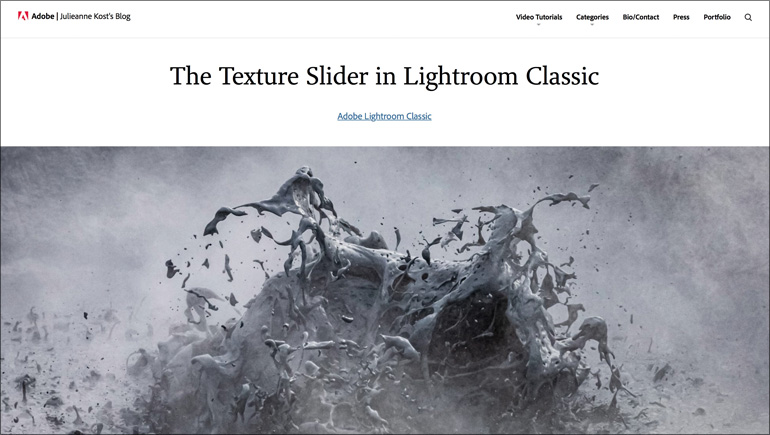
I saw a post this week in my feed and it noted that the Texture Slider was the first new slider added to Lightroom in four years (I guess the last slider added was the Dehaze slider). Of course, there’s been a ton of new features added since then, but as far as sliders go, I think they might be right. Well, thankfully, this new slider has been worth the wait.

I also ran across this excellent post from Adobe’s own Julieanne Kost, and I wanted to share it here because (a) Julianne’s awesome (b) it’s one of the best descriptions I’ve seen of it anywhere (c) her animations (there are embedded GIFs) really give you a great idea of why this slider is so significant.
Here’s a link to her post.
Thanks, Julieanne for sharing this insight into this important new feature.
Well, I went and did it. I went mirrorless
It’s true. The full story (and a Q&A) is over on my daily blog today.
Have a great weekend, everybody!
-Scott
P.S. If you’re wishing you had signed up to go to the Photoshop World Conference in Orlando (it’s in two weeks), it’s not too late: photoshopworld.com
The post How to Use Lightroom’s New Texture Slider (and why it’s so awesome) appeared first on Lightroom Killer Tips.
