
Try this next time you edit a photo
So many people increase Contrast to add pop to a photo, but they aren’t aware that they can also be damaging other tones in the image. Here is another way of adding some punch, while preserving the details in and image and increasing its quality.
After editing thousands of photos, I found myself naturally gravitating to these adjustments and I want to share my findings with you.
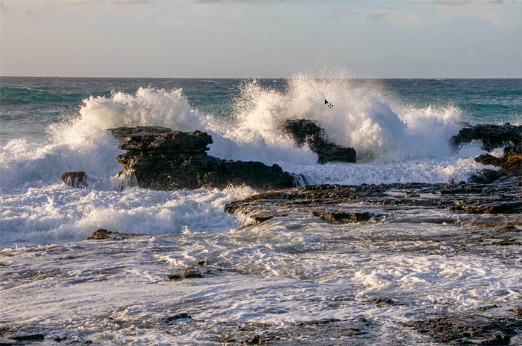
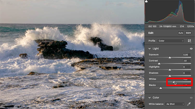
Here is the starting photo. Note: I have made some initial adjustments to shadow and highlight and exposure.
Do you ever use the contrast adjustment in Camera RAW or Lightroom? Most people use this the opposite to what produces the best results.
In Photoshop Choose Filter>Camera RAW Filter (It’s the same in Lightroom too)
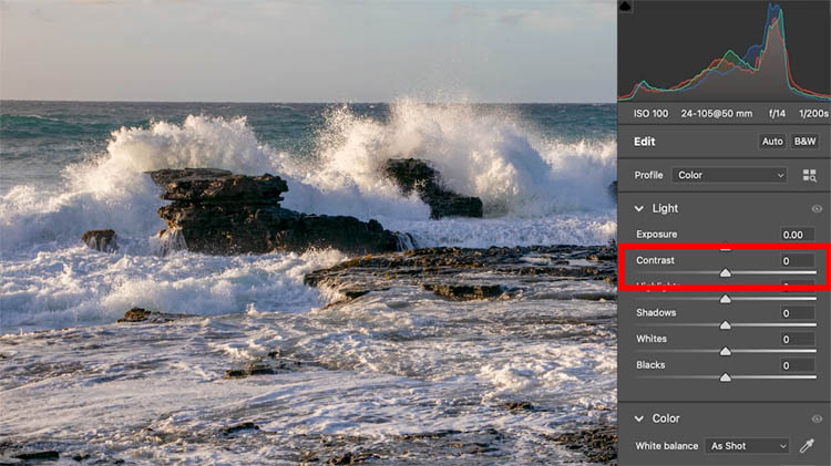
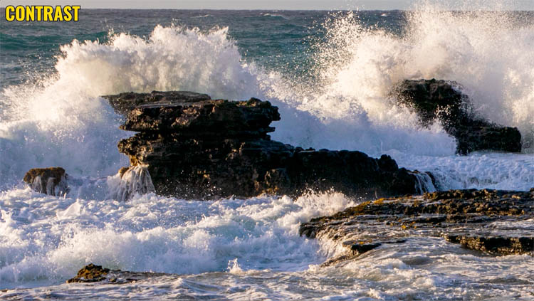
Most people increase the contrast to add pop to the dark and light areas of the photo.
But look at how we are losing so much detail in the dark rocks and the water looks thick and dense.
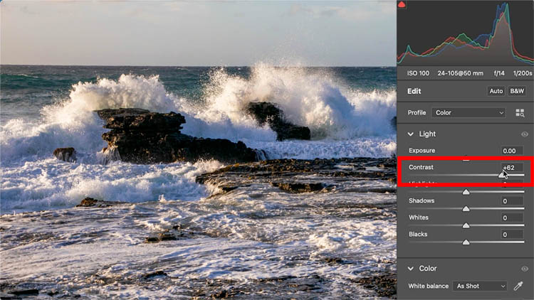
Instead, reduce the contrast a little bit. Notice in the image below, the detail in the rocks and how much more natural the water looks.
We will bring back the darks and lights, but in a different way.
One of the things I have noticed is that contrast is very similar to moving both the black and whites.
Examine the histograms
Look at the charts and notice the histograms are very similar (not exact, but similar results). Contrast also affects the midtones, but to a lesser degree..
Reducing contrast, compresses the histogram towards the middle (preserves highlight and shadow detail). Minimum settings on Black and white sliders do the same thing.
Inversely, the you increase the contrast. you stretch or expand the histogram and clips or loses details in the extremities. Pushing Blacks and whites does the same thing.
This is important because, rather than increasing the contrast, we can reduce it and bring back the dark and light contrast using blacks and whites and thus get separate and more control over the tones.

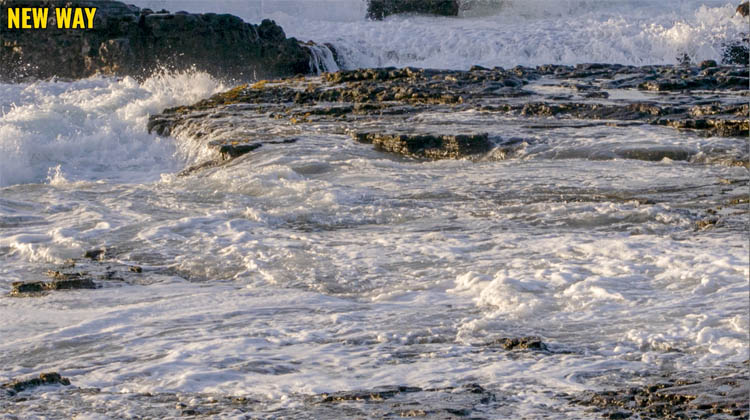
In the image with the reduced contrast, move the blacks to the left to bring back the body to the darks and slightly increase the whites to brighten the brightest parts of the image.
This adds the pop without zapping the details and making the image look crunchy.
Here is the original image

With contrast added
Reducing the contrast, but adding pop with black and whites. More details and lighter looking foam (as in weight and density, not just tone)

Look at the foreground foam, See how contrast separated the foam and water and looks dirty
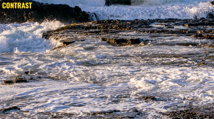
With the reduced contrast, the water and rocks look more natural.
Obviously this isn’t the only adjustment I make to a photo. But I wanted to share a different way of using contrast, that in my opinion produces better results. Check out the 2 minute video at the top to see a bit more.
This is the way I have been using contrast myself for a while now.
I hope you found this useful.
Great to see you at the CAFE
Colin
The post Photoshop contrast alternative makes every photo better appeared first on PhotoshopCAFE.