Welcome back once again and by now, you’re probably getting a little tired of the whole learning Layers thing, but I have good news. This week wraps up the Layers portion of our Photoshop journey, so next week, we’ll open a new can of worms…er, I mean some other important Photoshop features.
Today we’re talking about using Layer Masks (finally!), which are fantastic, but now that there are a bunch of new masking features inside of Lightroom, you probably won’t have to use Layer Masks as often as you would have before. However, they still allow you to do things you can’t do in Lightroom, so they are definitely worth knowing, and they open a whole new world of Layers possibilities, so this is still really big important stuff. We’ll start by blending three images together, creating a collage (or a montage, or whatever you call it).
Let’s open the three images we’re going to put together (seen here). I’m making them available for you to download if you want to follow along using the same images, but I encourage you to use three of your own images. By the way – there is a Photoshop feature that puts your images side-by-side on screen like this (it just resizes your documents so they fit on screen either horizontally or vertically, as I did here). You choose these document “arrangements” by going under Photoshop’s Window menu, under Arrange, and making your choice there (I chose 3-up Vertical). If you choose one of those arrangements for your images and want to get back to our regular view, go under that same menu and select ‘Consolidate All To Tabs.”
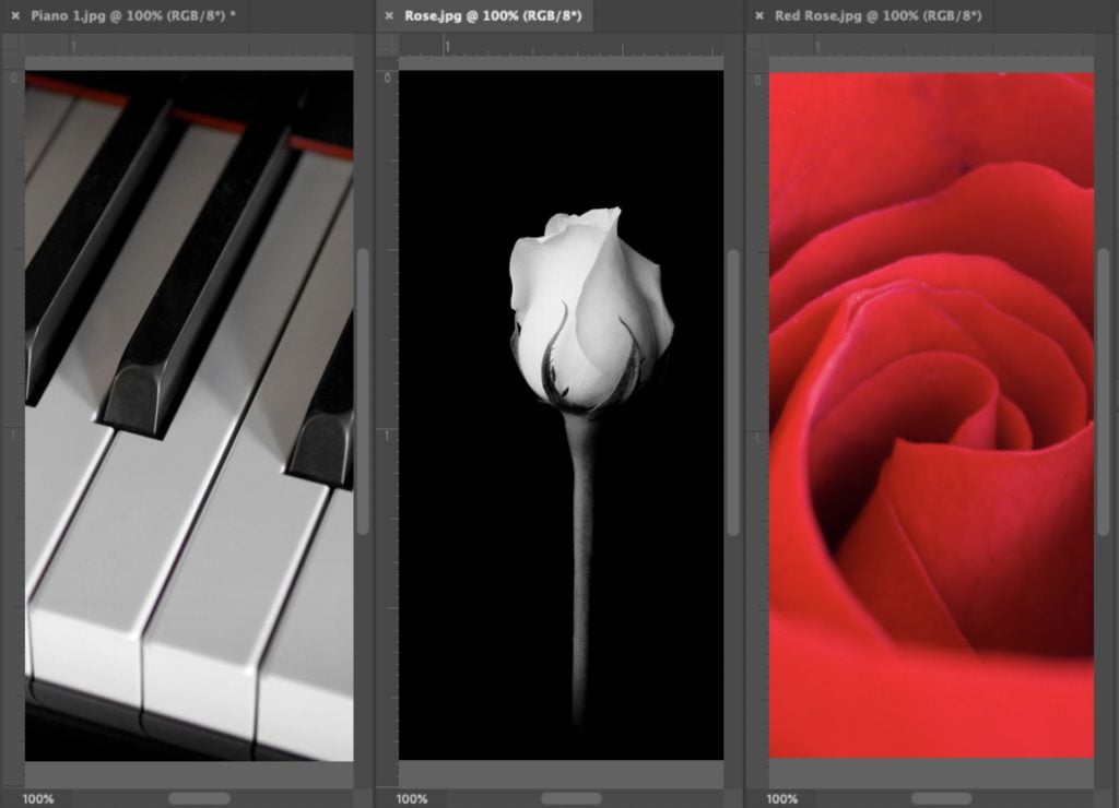
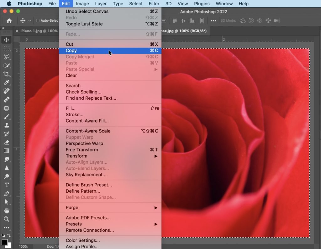
Open the piano image (or whatever image you want to use as the background for your collage). Now click on the tab for the first image you want to blend with the piano image (in this case, we’ll choose the red rose). Press Command-A (PC: Ctrl-A) to select the entire image and then go under the Edit menu and choose ‘Copy’ to copy the red rose image into memory.
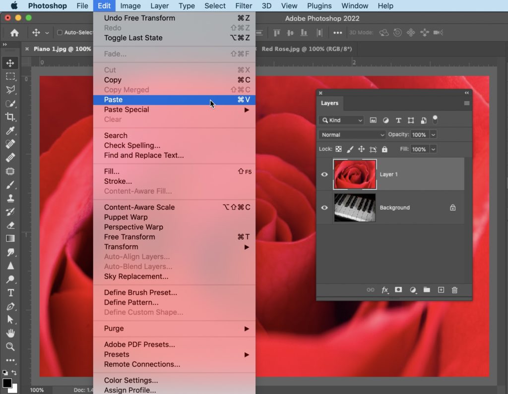
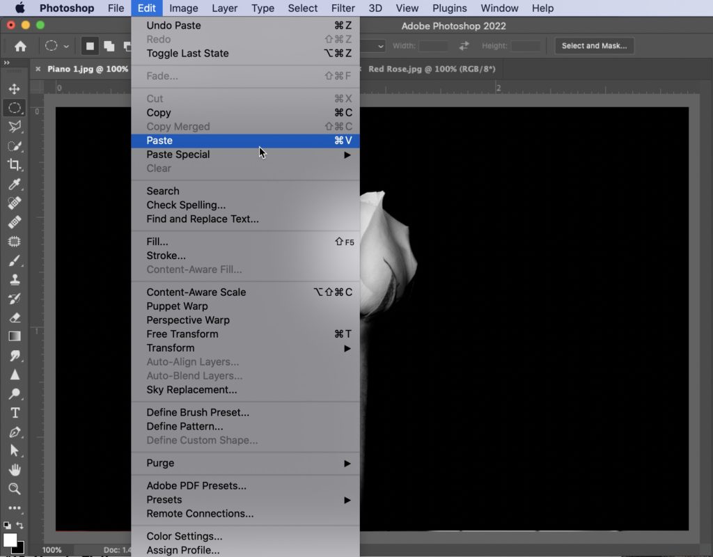
Now switch to your Piano document (or whichever image you’re using as your background image); go under the Edit menu and choose ‘Paste’ to paste your red rose image on top of the piano image.
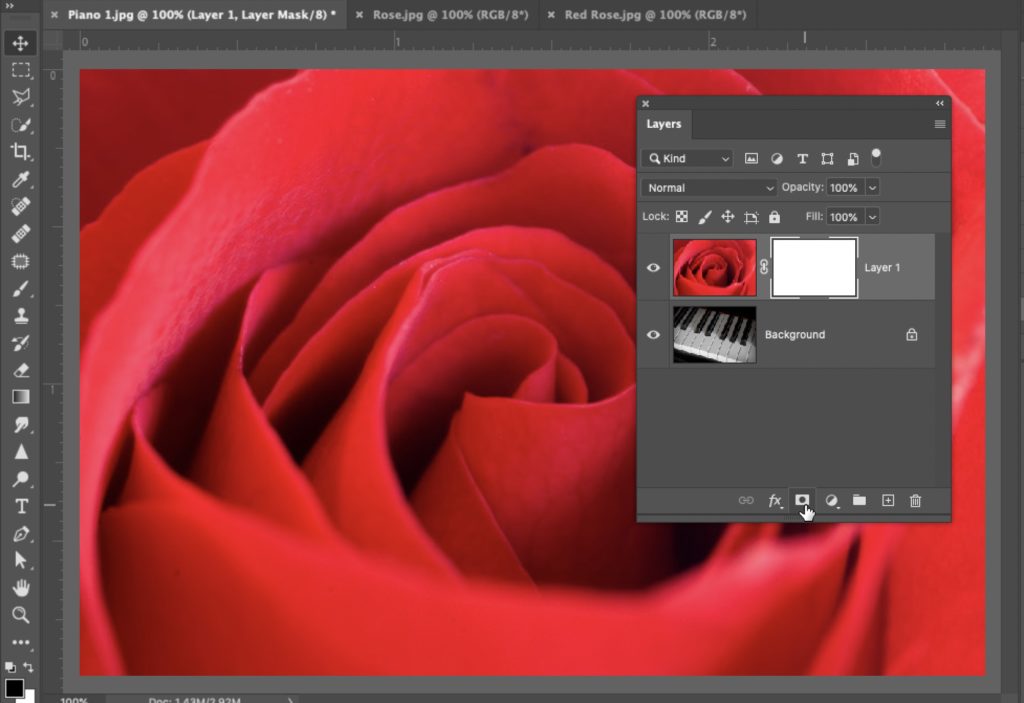
Now we’re going to add a Layer Mask. Go to the bottom of the Layers panel and click the “Add Layer Mask” button, as shown here (it’s the 3rd icon from the left and looks like a rectangle with a circle cut out of the center). This adds a white layer mask to this layer (you can see it in the Layers panel – it’s the white rectangle that appears to the right of the Layer).
OK, before we head to the next step, it’s time to lay one of the old sayings about layer masks, which has been around for 200+ years, and that is, “Black conceals and white reveals.” If your layer mask is black, whatever is on that layer is hidden from view. If you took a paintbrush and painted with White as your foreground color, wherever you painted, it would reveal what’s on that layer. If the layer mask is solid black, whatever on that is hidden. If it’s solid white, you can fully see everything on that layer. So, if you painted in black on that white layer mask, it hides whatever you painted over. This will make more sense in a minute, but if you keep that line in mind – “black conceal and white reveal,” it will help you when you’re not sure what to do next.
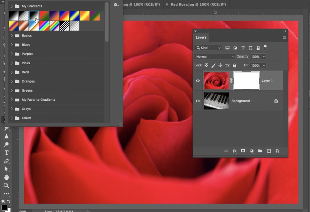
One of my favorite ways to blend images using a layer mask is to use the Gradient tool. So, let’s get the Gradient tool from the Toolbar, and once you have it, go up the Options bar, and up near the top left, click on the down-facing arrow to the right of the currently selected gradient to bring up the Gradient picker. Next, choose the third gradient from the left – the Black to White gradient.
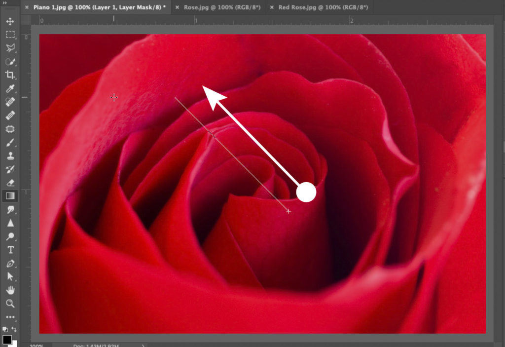
Take the Gradient tool and drag diagonally across your image, starting at the point where you want to start revealing the background layer (this part will be the black part of the gradient) and dragging up toward the top left and stopping where you want to rose to be fully visible (that will be where the white part of the gradient is). You can see where I dragged the gradient tool in the image shown here (starting at the bottom right and dragging up toward the left). The white arrow shows the direction I drew – the actual gradient tool path is the thin line on the left.
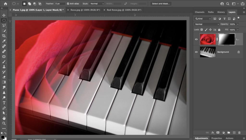
Here’s what it looks like when you stop dragging the gradient tool – you have a blend between the two layers. What you’re really doing here is smoothly hiding parts of your red rose layer (on the bottom right) and gradually revealing the red rose layer as you move to the top left. The gradient creates that smooth blend because in-between solid black and solid white are shades of gray, which create different levels of transparency. If you dragged a very short way with the tool, it would be a very quick, abrupt blend. The farther you drag the tool, the longer and smoother the blending will appear. If you look over in the Layers panel, at the 2nd thumbnail from the left (the one to the right of the red rose thumbnail), you’ll see the gradient you created on that layer mask. The black parts of that gradient hide the rose. The white parts show the rose. The gray graduation between them is the smooth blend between the two layers.
OK, now that you know the process, let’s add a third image to our collage. Open the black and white rose image; select all, then copy and paste it over onto your piano/red rose document. It will appear as its own layer at the top of the layers stack in the Layers panel.
Switch to the Move tool and drag the rose over so it appears on the right side of the image. Now, it’s blending time: go to the Layers panel and click the “Add Layer Mask” button at the bottom of the panel (it’s the third icon from the left) to add a layer mask (you’ll see the layer mask thumbnail appear to the right of this top layer in the Layers panel).
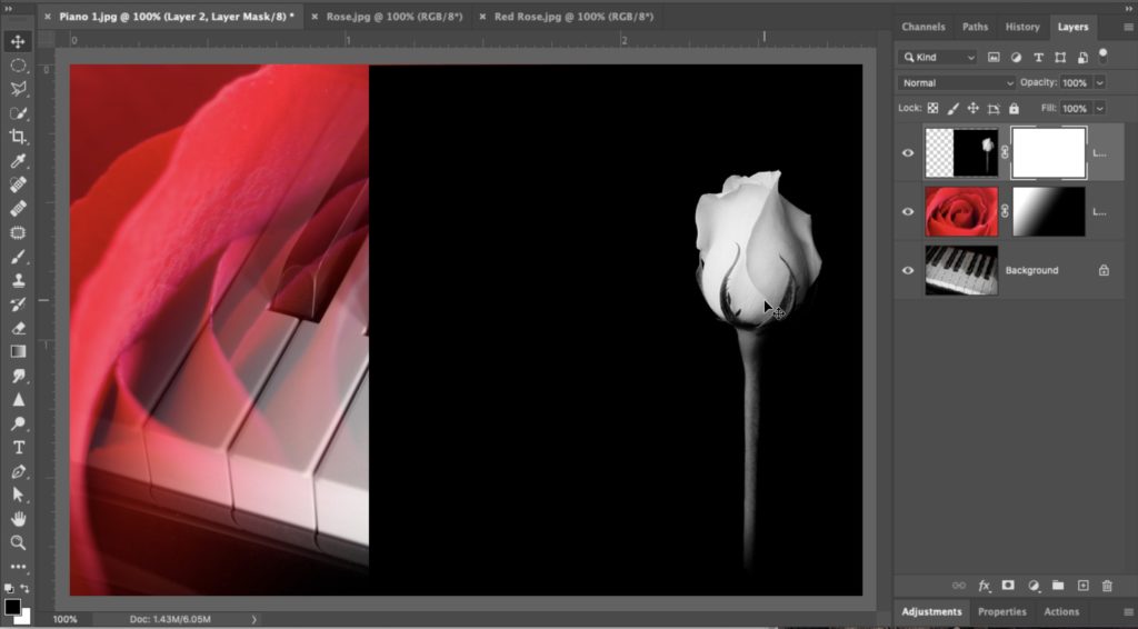
Take the gradient tool and drag from the left edge of the black and white rose layer (as shown here) over to the right to around the center of the rose (as shown here).
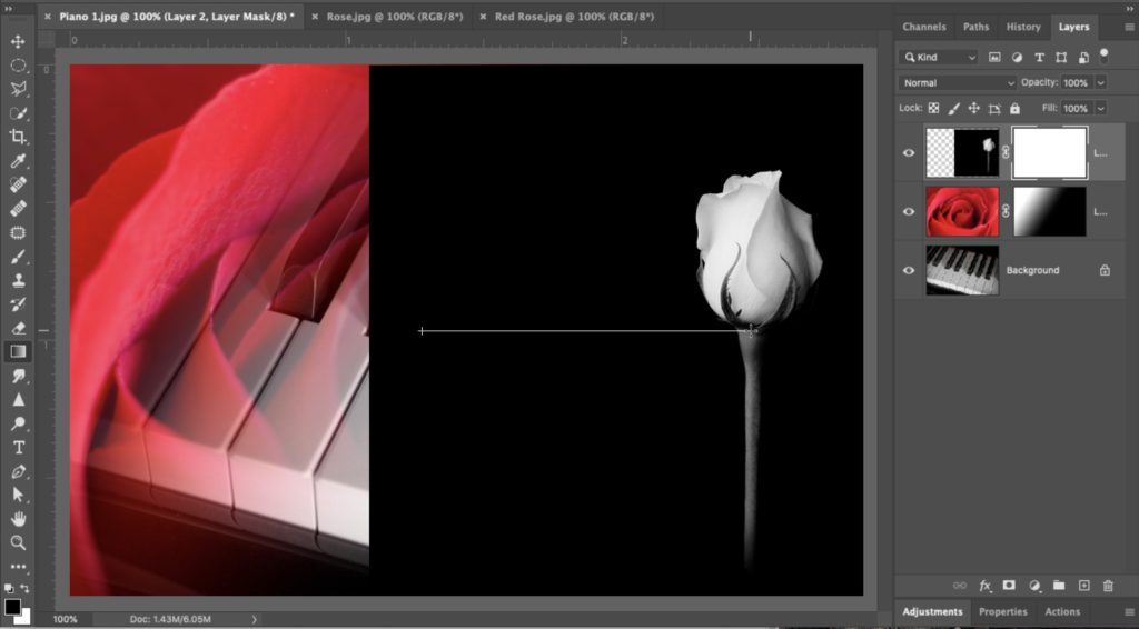
What we did, by dragging from the left edge, is to conceal that part of the layer. So that part of the top layer is concealed (so you don’t see a hard edge), but then it gradually reveals the black and white rose, giving us the blend effect (as seen here).
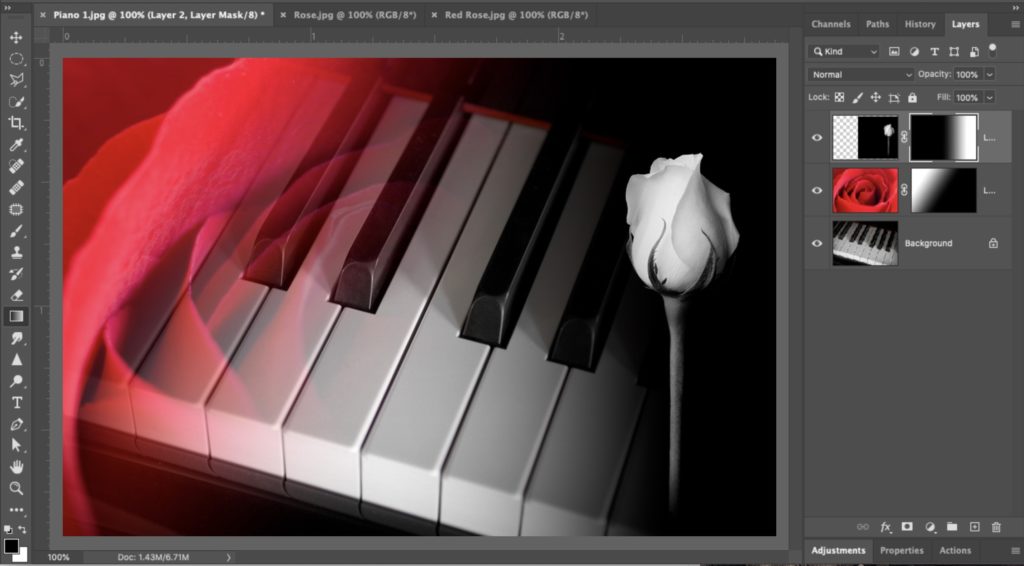
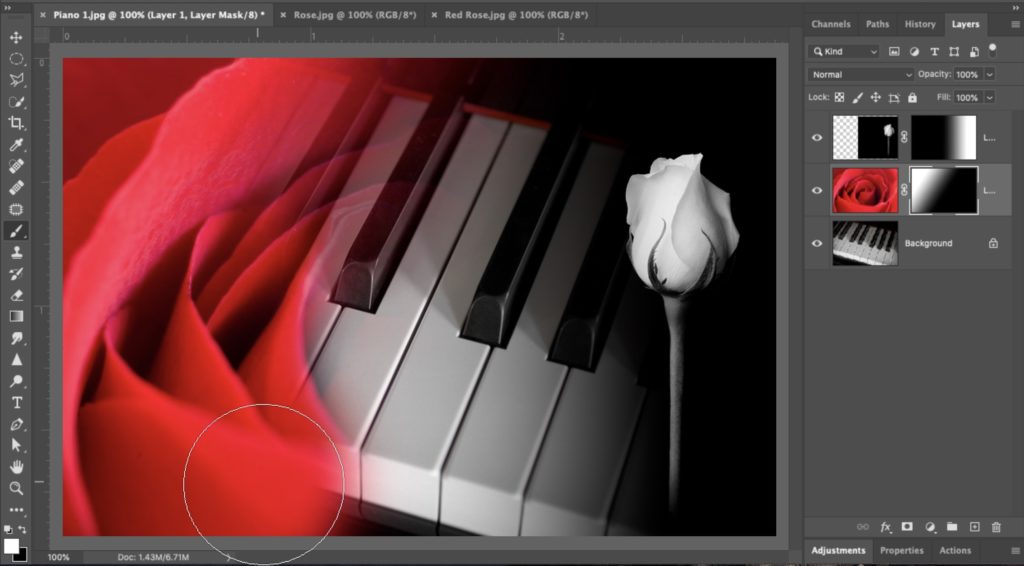
If you want to edit this blend, you can switch to the Brush tool, and the same rules apply – if you paint in black, it will hide (conceal) the areas you paint over with the brush. If you paint it white, it will reveal more of that black and white rose layer. So, let’s give it a try; get the Brush tool; choose a large soft-edged brush from the Brush picker (up in the top left corner of the Options bar – click the same little down-facing arrow icon you did to bring up the Gradient Picker, and it will bring up the Brush picker. In the Layers panel, click on the middle layer (the red rose layer). Choose a large, soft-edged brush, set white as your foreground color, and paint along the bottom of the red rose and bring back (reveal) more of the rose (as seen here). If you make a mistake, it’s easy to fix (one of the awesome things about Layer Masks); you just switch your foreground color to black and paint over the area where you messed up.
OK, last thing or two: let’s delete the Layer Mask altogether – go to the Layers panel; click on the thumbnail for the Layer Mask on the Red Rose layer, and drag it down to the trash icon at the bottom of the panel.
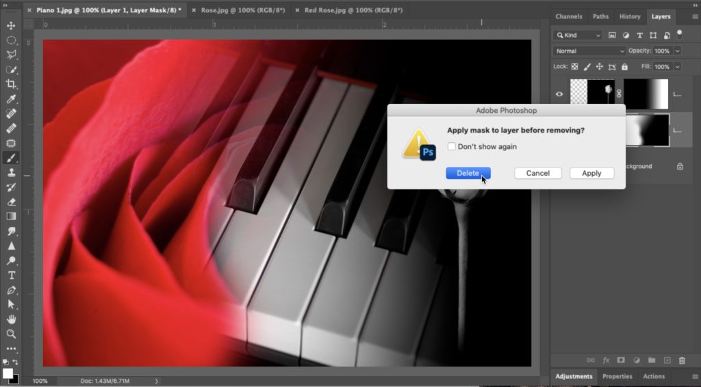
This will bring up a dialog asking if you want to delete or apply the mask (as seen above). If you choose Apply, it makes your layer mask permanent, and you can no longer paint or on it or use a gradient. If you choose Delete it deletes the mask, and you’re starting over from scratch on that layer, so select “Delete.”
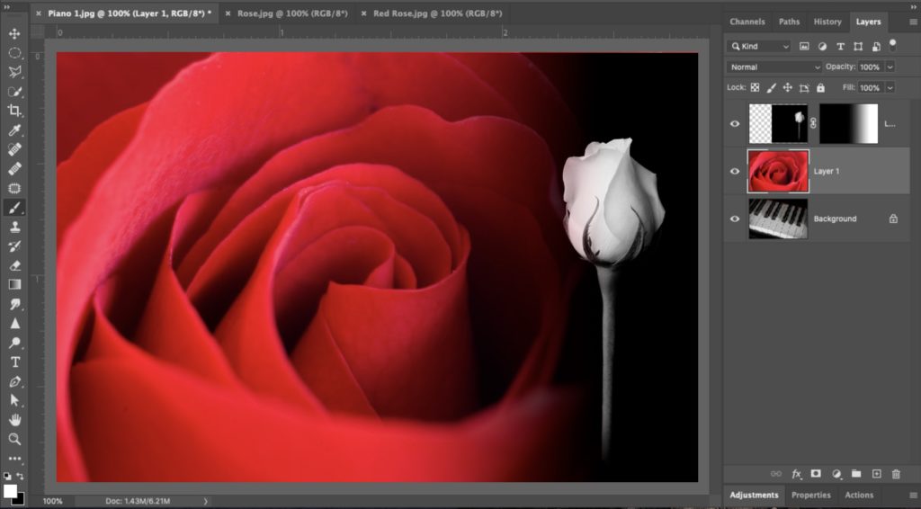
Here’s how it looks (above) once you delete the red rose layer’s Layer Mask. The right edge still looks blended, but that is just because you’re seeing the blending from the black and white rose layer. So, next, let’s add a new mask to this red rose layer.
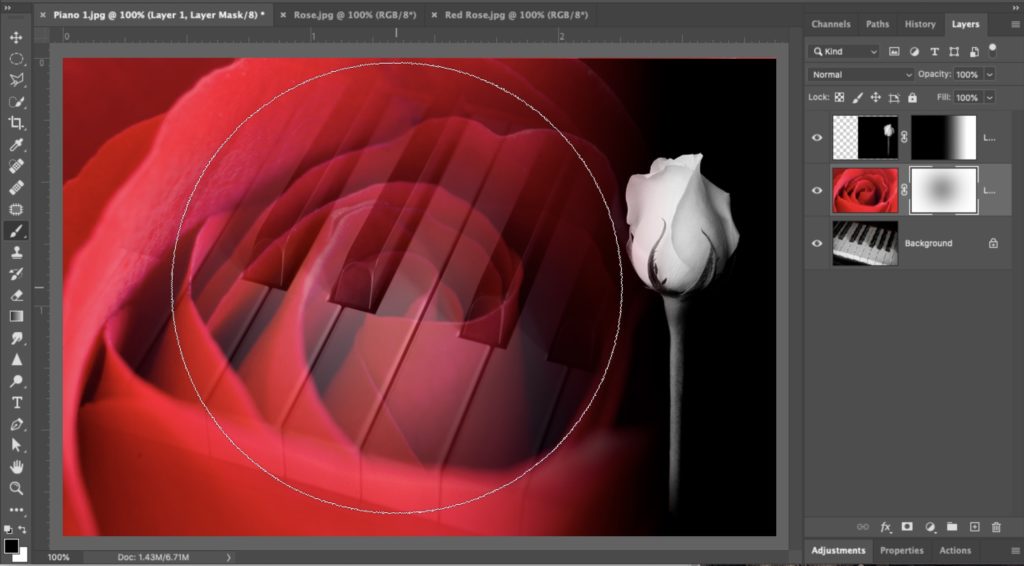
Click the “Add Layer Mask” button and then make your brush size really large (hit the right bracket key on your keyboard a few times until your brush size is really large. Go up the Options Bar up top and lower the Opacity of this brush to 50%. Now it’s not painting white or black – it’s painting gray, so when you click with the brush, it will make the area where you clicked particularly transparent. It makes for a nice blend, so make sure black is your foreground color, and then just click once in the center of the rose to get the nice blend you see here, where the outside of the rose is solid, and the center is kind of a bit see-thru.
Here today, we just did some simple blending of images to kind of introduce the concept, but there’s so much more you can do. For example, one thing I commonly do is to use a Layer Blend mode (we covered those back a few weeks ago), to add a look, like maybe adding more contrast with the Overlay mode, then I hold the Option key (on Mac, it would be the Alt key on a PC), and click the Layer Mask icon. This gives you a layer mask that is filled with black so that it would hide that contrasty Overlay layer from view. Then, you can get the Brush tool and paint white over any areas you want to have a more contrasty look. Of course, you can do this with Screen mode to brighten the area or Multiply to darken, and this is just the start of using this powerful tool, but at least we dipped our toes into the cool water of the Layer Mask pool, and it feels good.
OK, well, there ya go. We’ll move on to some other important parts of Photoshop next week. While we won’t be focusing on Layers anymore, you’ll see layers again and again as we move forward because they’re such a powerful and important tool and one of the main reasons we jump from Lightroom to Photoshop in the first place. 
The post Photoshop For Lightroom Users: The Power of Layer Masks appeared first on Lightroom Killer Tips.
