They feel like Presets, but in some ways they’re better than presets, or maybe I should say, they make Presets even better. Yeah, that makes more sense. Anyway, I talk to people all the time who have heard about Adobe’s relatively new Profiles, and while some are using the RAW profiles, a lot of folks are missing out on the equally awesome Creative Profiles, so today I’m sharing what I feel are “The Three Top Reasons Why Lightroom’s Creative Profiles Are So Awesome!
NOTE: The Creative Profiles are found by clicking on the little four-rectangle icon near the top right of the Basic panel, right below “Black & White.”

Using a Creative Profile Doesn’t Move Your Sliders
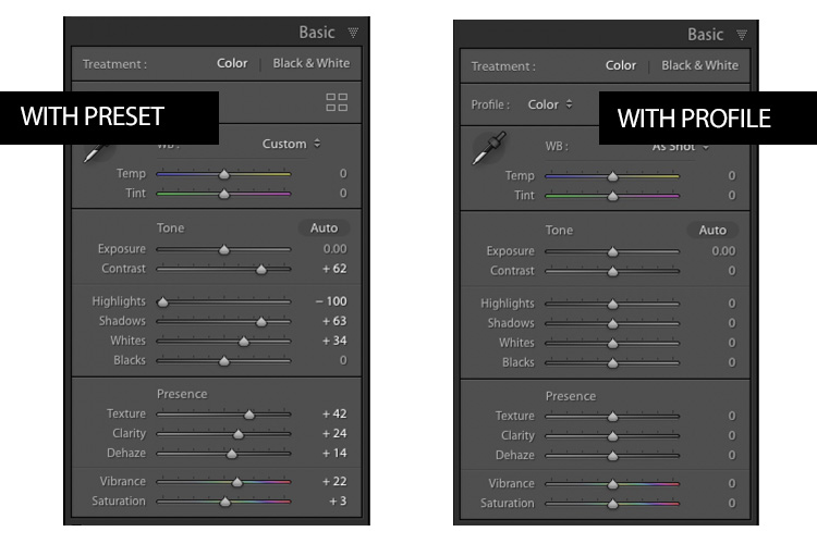
This is a biggie. When you apply a Preset in Lightroom to get a particular look, it just moves your sliders (some or a bunch) to a “preset” position. However, when you apply a Creative Profile, it doesn’t move any sliders whatsoever.

So, you can apply a Creative Profile, and then start tweaking your image without messing up its look (if you apply a preset, and then move any of the sliders in the preset, it changes the look of the preset). You can also apply a preset, and then apply a Creative Profile to your image without messing up the Preset. It’s a totally separate way to give your image a look that doesn’t mess with your sliders or any preset you applied. Huge!

You Can Control The Amount With Just One Slider
When you apply a Preset, to lower the intensity of the preset, there’s no built-in easy way to move all the sliders proportionally to reduce the amount of the preset by say 15% or 22%.

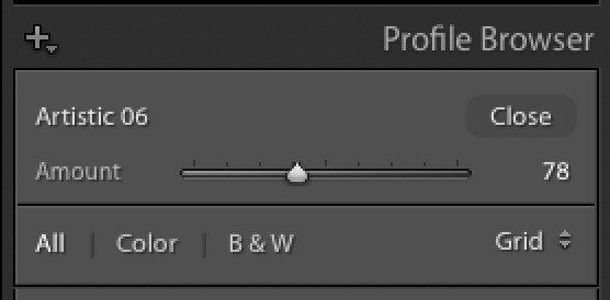
However, when you apply a Creative you have an Amount slider (seen above) and you can either make the creative look you just applied through this profile either more intense or more subtle by simply moving the Amount slider (here I lowered the amount by 22%).

It’s Easy To Save Favorites For Quick Access
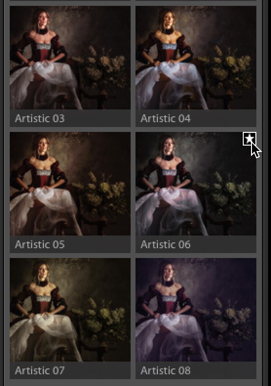
If you find a Creative Profile (Color or B&W) you like, you can just click the “star” icon up in its top right corner ((as seen below) and boom — it’s added to your main Profiles pop-up menu. It doesn’t get much easier than that.

There ya have it. If you’re not taking advantage of these built-in Creative Profiles, I hope this gives you three reasons to give them a shot. 
Here’s to a great week — hoping yours is a healthy, happy, creative one! 
-Scott
P.S. We just announced “The Landscape Photography Conference,” last Wednesday, and already nearly 400 photographers have signed up. It’s coming this September 8-9, 2020. If you missed the news, catch the short launch video (link), or you can get your tickets right here.
The post The Three Top Reasons Why Lightroom’s Creative Profiles Are So Awesome! appeared first on Lightroom Killer Tips.
