I get this questions more than you might think, and it’s actually an easy answer: It’s because we’re using different versions of Lightroom, but both of them are current, up-to-date versions of Lightroom. Both share many of the same features, and the main difference between the two is how your images are stored.
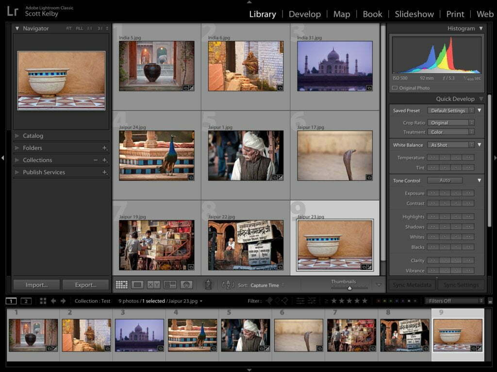
Above: Lightroom Classic
If your Lightroom looks like this, with a bar across the top that says ‘Library | Develop | Map | Book | Slideshow | Print | Web — you’re using Lightroom ‘Classic’ the version that has been around nearly 12-years now. If you use this version, you store your images on your computer or on an external hard drive. You can sync any photos you want to Adobe’s mobile apps for your phone, tablet, or Lightroom web.
What you’re seeing above is the Library view; where you sort and organize your images.
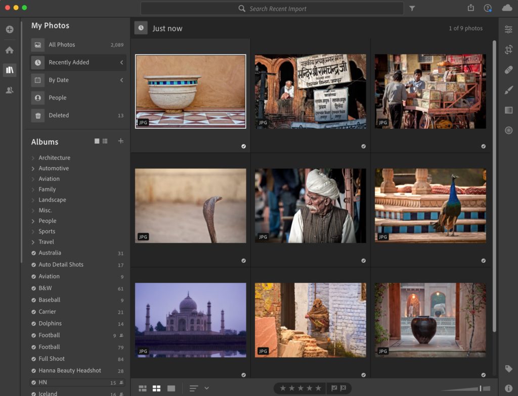
Above: Lightroom (Cloud)
If your Lightroom looks like this (no bar with modules across the top), and it says “My Photos” on the left side, you’re using the version of Lightroom that stores your images in Adobe’s Cloud by default. When you import your images, the high-resolution originals are sent to Adobe’s Cloud and you work with Smart Previews on your desktop or mobile device. All your photos are automatically sync’d to Adobe’s mobile apps for your phone, tablet, and Lightroom web.
What you’re seeing above is the My Photos view; where you sort and organize your images.
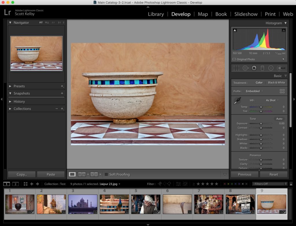
Above: Lightroom Classic’s Develop Module
In Lightroom Classic, when you want to edit your images, you do that in the Develop Module (you click on the word Develop), and there you’ll find the familiar Basic Panel sliders (Exposure, Contrast, Highlights, Shadows, and so on) in the panels on the right.
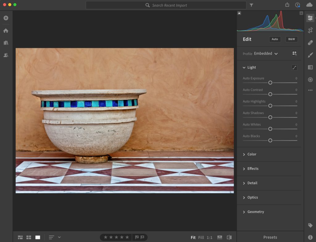
Above: Lightroom (Cloud) Editing Controls
With the Cloud-storage version of Lightroom, you don’t change modules — your edits are done in the organizing area — you just pop out the right side panel and there are the family editing controls (Exposure, Contrast, Highlights, Shadows and so on). Both Classic and Cloud share the same sliders in the same order that do the same exact things using the same math.
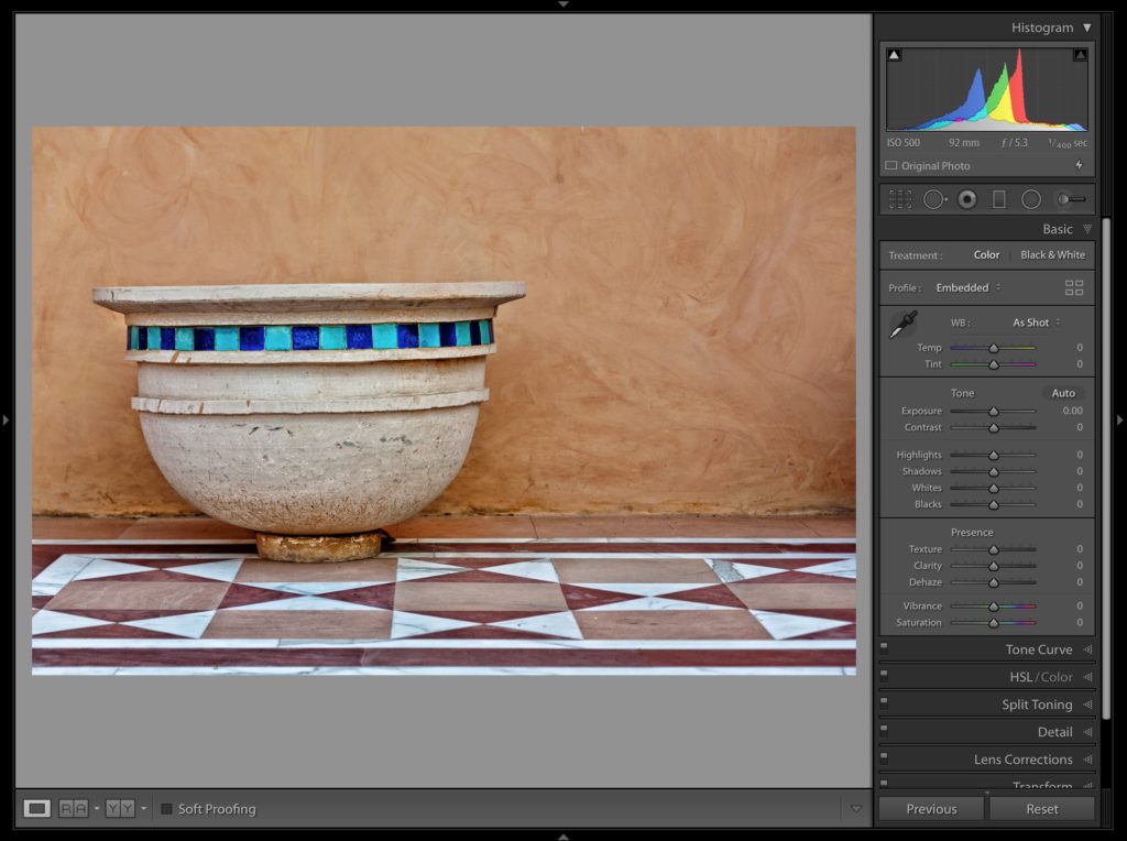
Above: Making Classic look more like Cloud:
If you want Lightroom Classic’s editing space to look more like ‘Clouds’ then you can close the left side panel and close the Filmstrip along the bottom (with Lightroom cloud you can make its Filmstrip visible along the bottom as well).
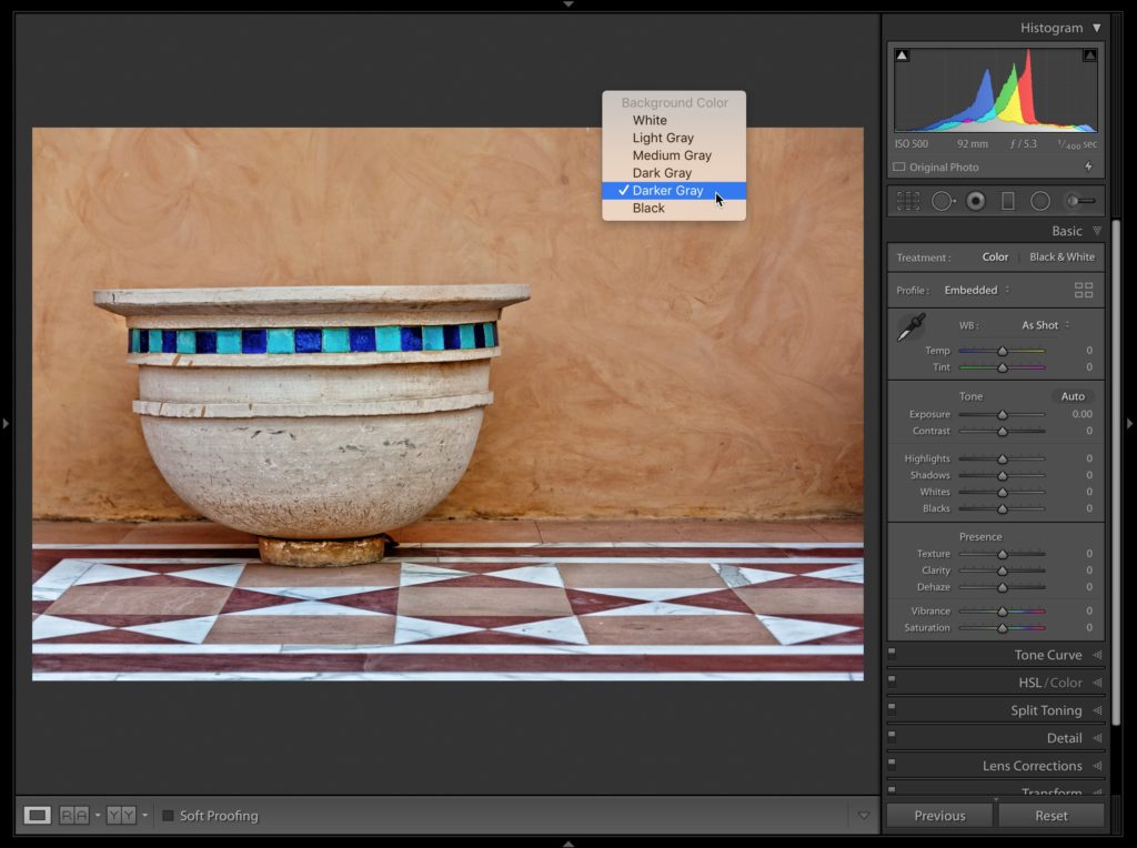
Also, Lightroom Classic’s background behind your image area is light gray. Cloud’s is dark gray. If you right-click anywhere on Lightroom Classic’s light gray background pop-up menu will appear (seen above). choose “Darker Gray” (as shown here), and you’re good to go.
Besides how it stores your photos, any other big differences?
Yup. Lightroom the Cloud version is still missing a lot of features that are in Lightroom Classic. Over time Adobe does keep adding more Classic features to Lightroom, but it still has a ways to go for full feature parity, and I think (just my opinion) there are features in Classic that will never make their way over to ‘Cloud’ because it’s designed for a different market, but both versions have people it’s perfect for, so more choice is better. 
Anyway, hope that helps a bit in knowing which version you’re using.
Here’s wishing you a better June than…well…anything else we’ve had this year so far. LOL!! 
-Scott
The post Why Does My Lightroom Look Different Than Yours? appeared first on Lightroom Killer Tips.
