
Color labels in Lightroom Classic can serve a variety of purposes. Most importantly, I think of them in terms of what aspects of my photography would be helpful to me to represent visually. Each of us would answer that question based on our own photography and how we think about our photo libraries, and there is no one right answer. In addition to our photos, recent updates have given us the ability to apply color labels to folders and collections too, so I thought it would be worth exploring how we can make the most of those colorful labels.
What is a Color Label?
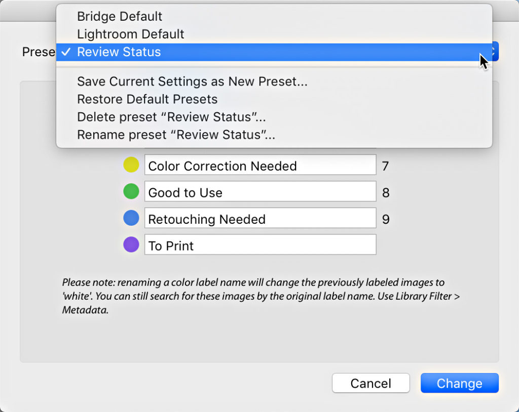
Color labels applied to photos are slightly different than the color labels we can apply to folders and collections. The colors are all the same (red, yellow, green, blue, and purple), but color labels applied to photos have both a visual color we can see around the thumbnail and an associated metadata tag that is also applied to the photo’s metadata space (color labels applied to folders and collections do not do this). It may seem like a distinction without a difference, but the difference could be useful to some. If you go to Metadata > Color Label Set, you will see that there are three different color label sets to choose from—Bridge Default, Lightroom Default, and Review Status. Lightroom Default will be checked (by default). There is also an Edit option at the bottom. If you click on Edit it will open the Edit Color Label Set dialog box.
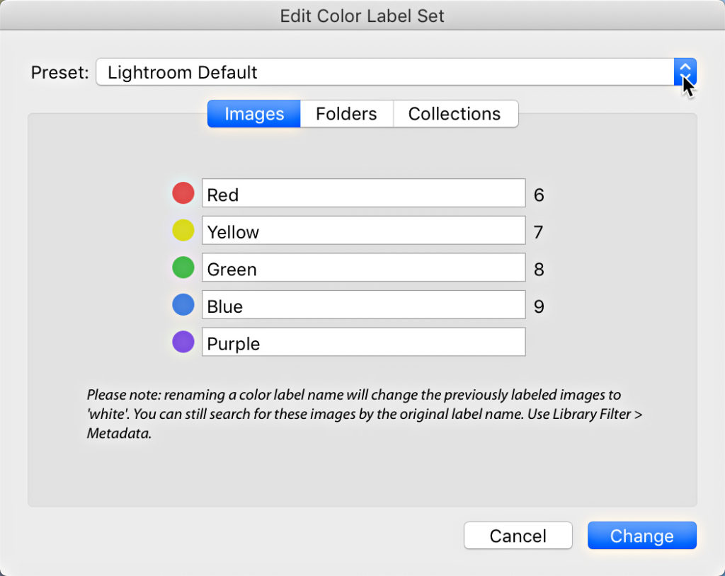
Looking at the Lightroom Default set, you will see that each color label is simply assigned the name of its color. Click the Preset dropdown menu and look at the labels for Bridge Default and Review Status. You’ll see that there are different labels associated with each of the colors in each set. These different labels may start to give you ideas about how you might make better use of the color labels too.
It is also possible to enter your own custom labels into each field, and save that as a new set. Note, that if you do this, any photos that had previously had a color label applied using a different set will lose the color representation (color goes to white, which is no color), though the old label will remain in that photo’s metadata. That means if I had previously applied a yellow color label to a photo, that photo will have a yellow tint around the thumbnail and the word “yellow” inserted into the Label field of the Metadata panel.
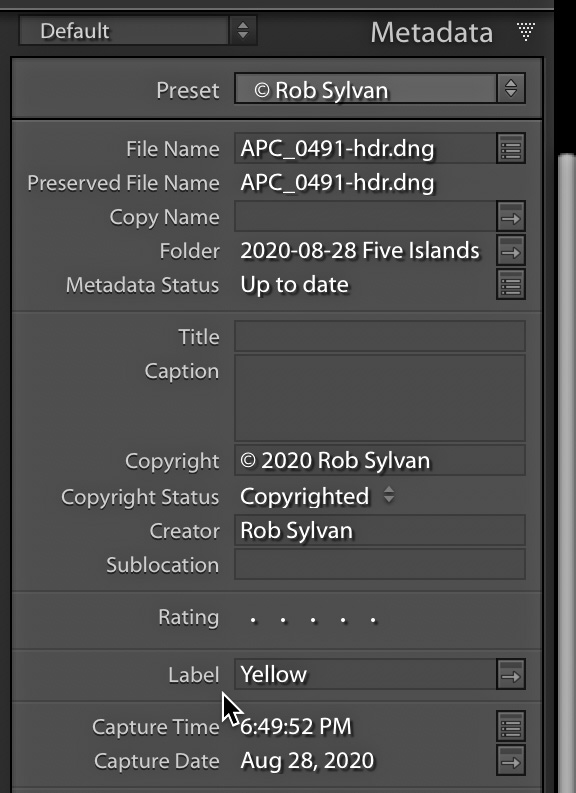
If I were to switch away from the Lightroom Default color label set to one of the others, or my own custom set, the tint around that thumbnail will go away, but the word “yellow” will remain in the metadata. This isn’t a problem per se, but worth noting before you change anything if you already have applied color labels. Also, worth noting is that the Label field is searchable via the Library Filter bar and smart collections. So, I don’t recommend going in there to change anything until you’ve given the issue some thought, and only if it makes sense to your workflow. I just leave mine on the Lightroom Default, and assign my own meaning to the colors.
Putting Color Labels to Use
Hopefully, seeing the different options in the different label sets has started you thinking about how you might use these to your benefit. I’ve seen color labels applied to photos in two main ways, either as a workflow tool to indicate where in the workflow a set of photos are (such as red = needs editing, yellow = work in progress, green = ready to deliver, and blue = delivered), or as a way to identify photos as belonging to some larger grouping (such as red = for focus stacking, yellow = for HDR merge, green = for HDR pano merge, and blue = for pano merge). There’s really no wrong way as long as it makes sense to you and that you are consistent in your application of labels for that purpose.
In my case, I like to shoot HDR, panos, HDR panos, and some focus stacking. Each of these pursuits tends to result in lots of source photos for the final merged results. I found that by applying color labels to the source photos for each kind it made it easier to look in a folder or collection and make sense of what those are all about. So, in my case I went with red = focus stack, yellow = HDR, green = HDR pano, and blue = pano (I bring purple in next week).
Because of the way color labels can be used by the Library Filter bar and smart collections it also makes it a useful way to find and gather those photos together or to filter the contents of a given folder or collection. As you think about how the labels can help your workflow, be sure to consider the role of filters and smart collections, as those can really supercharge their usefulness (we’ll explore those further in part 2 of this article next week).
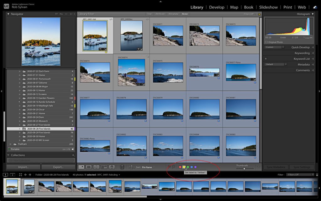
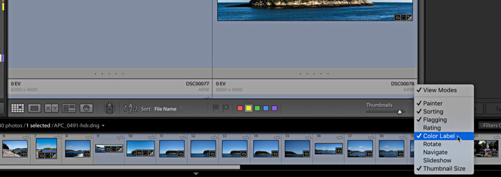
You can apply color labels to photos by selecting the photos in Grid view or Loupe view, and clicking the corresponding color label in the Toolbar (press T if your Toolbar is hidden, and click the disclosure triangle on the right side if the color label icons are missing from the Toolbar). You can also right-click selected photos and choose the desired color label from the contextual menu.
A faster way is to use the associated keyboard shortcuts. While the 0 – 5 keys correspond to star ratings, the 6 – 9 keys are for the red, yellow, green, and blue color labels respectively (no shortcut assigned for purple). You can also see the shortcuts by going to Photo > Color Label menu if you forget.
Once you’ve settled on a scheme for how you want to use those labels, you want to develop a practice to use them all the time so that you get the most benefit from them. Come back next week and we’ll look at how we can expand that practice to include folders and collections, and then leverage all of that using filters and smart collections.
The post Making the Most of Color Labels in Lightroom Classic: Part 1 appeared first on Lightroom Killer Tips.